Data Grid
Data Grids allow users to add multiple components on to a line item grid. Once placed, users can add multiple components inside of the Data Grid. Additionally, any number of grids can be added within a form which is especially useful when needing the ability to add or duplicate multiple fields sets.
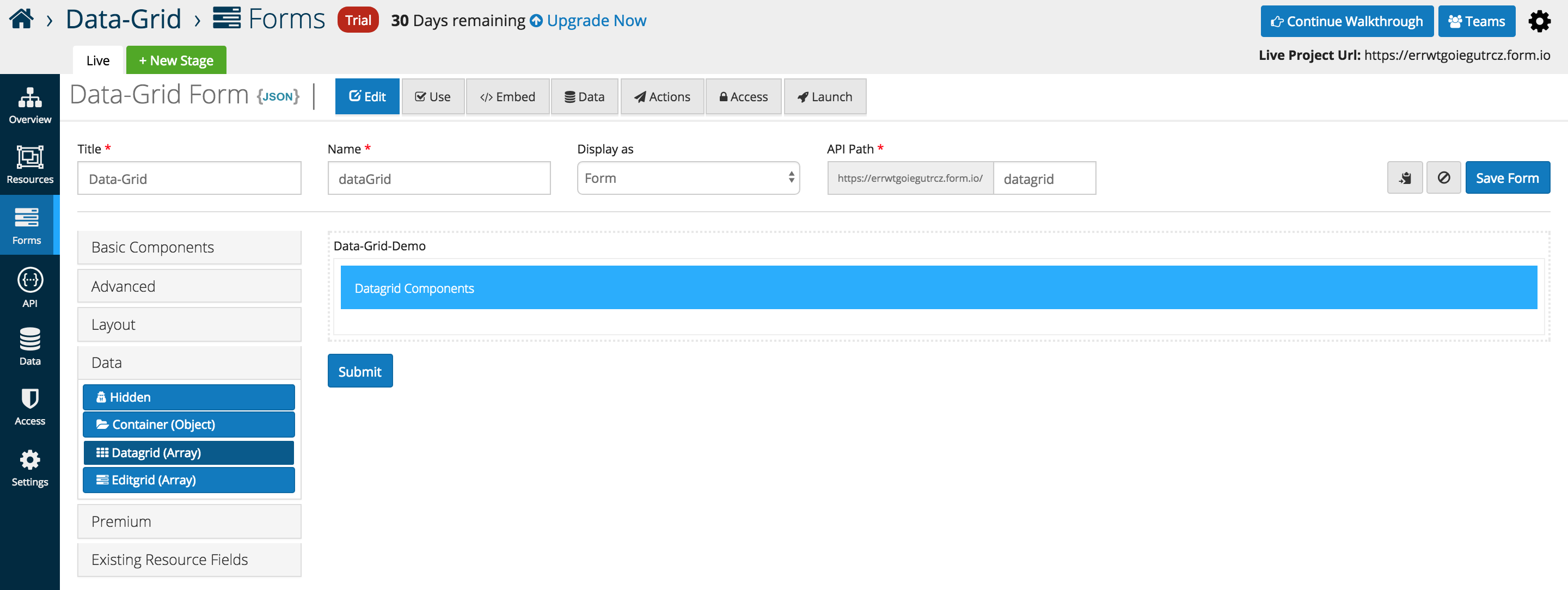
From the Data component menu, add the Data Gird (Array) to any active form. By default the grid is empty but can have other form components placed inside.
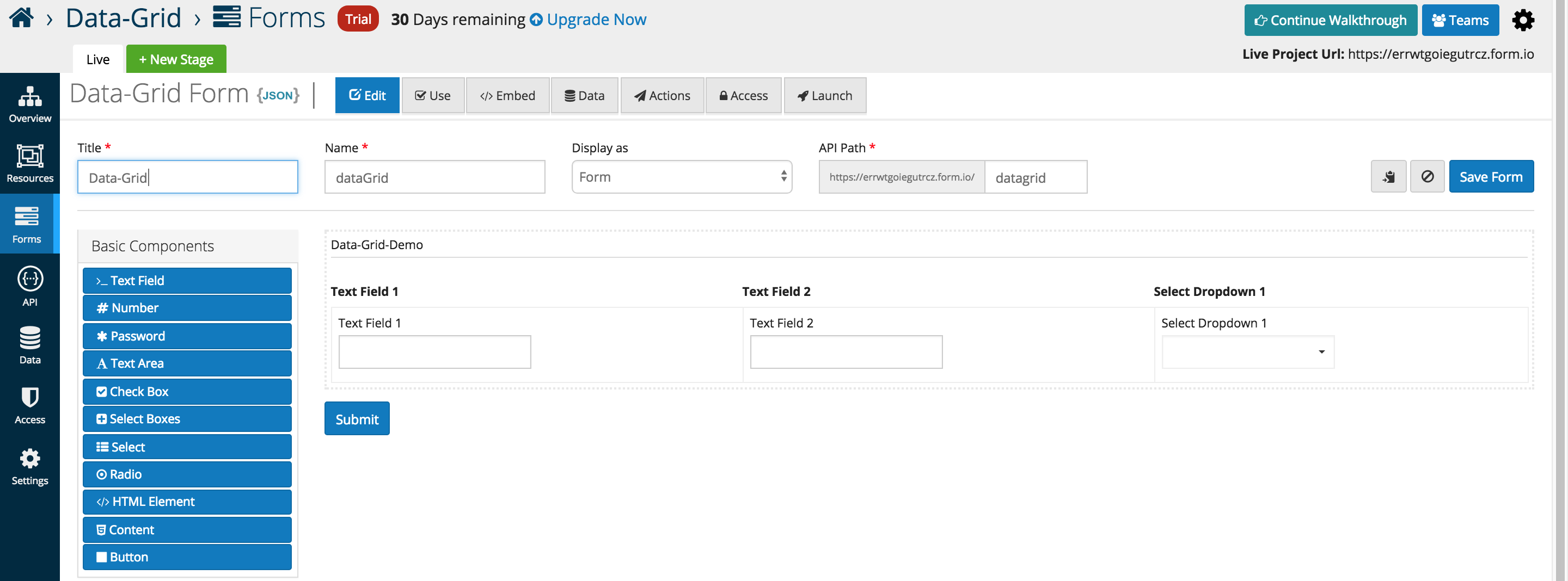
The example below illustrates three Basic Components placed inside of a Data Gird (Array). A new column is automatically added whenever another component is added the the data grid interface
Below is an in depth look at the specific data grid options that users can add or interface with as of the 5.0.0 release.
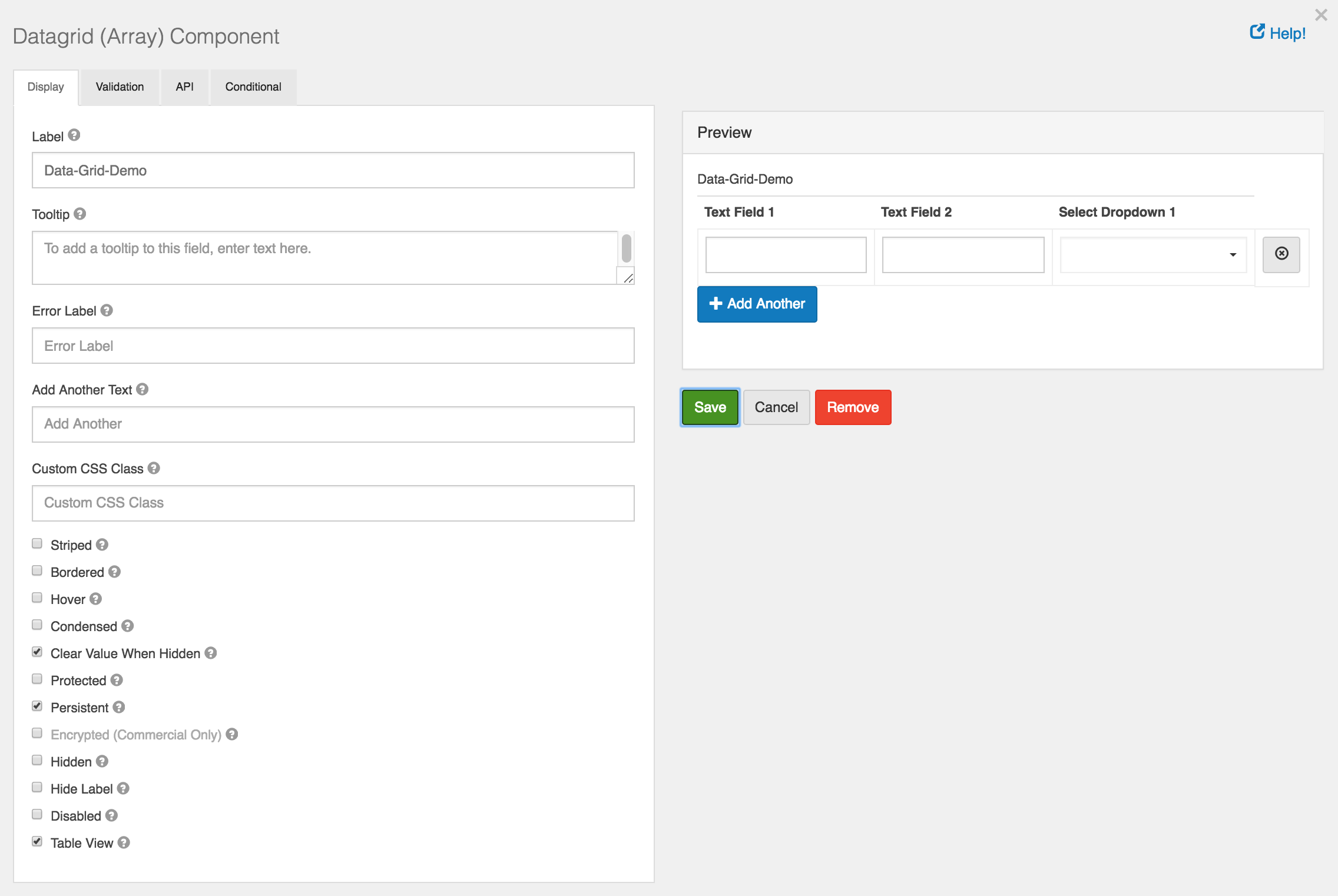
Add Another Text
- Text that will display for the Add Another button instead of the default.
Add Another Position
- Position for Add Another button with respect to Data Grid Array.
Striped
- Whether or not the table is striped for odd and even rows.
Bordered
- Whether or not the table has a border set on it. (This can be changed by your own CSS as well)
Hover
- Whether or not to add a hover class on rows when the mouse hovers over them.
Condensed
- Whether or not to condense the size of each sell by removing padding.
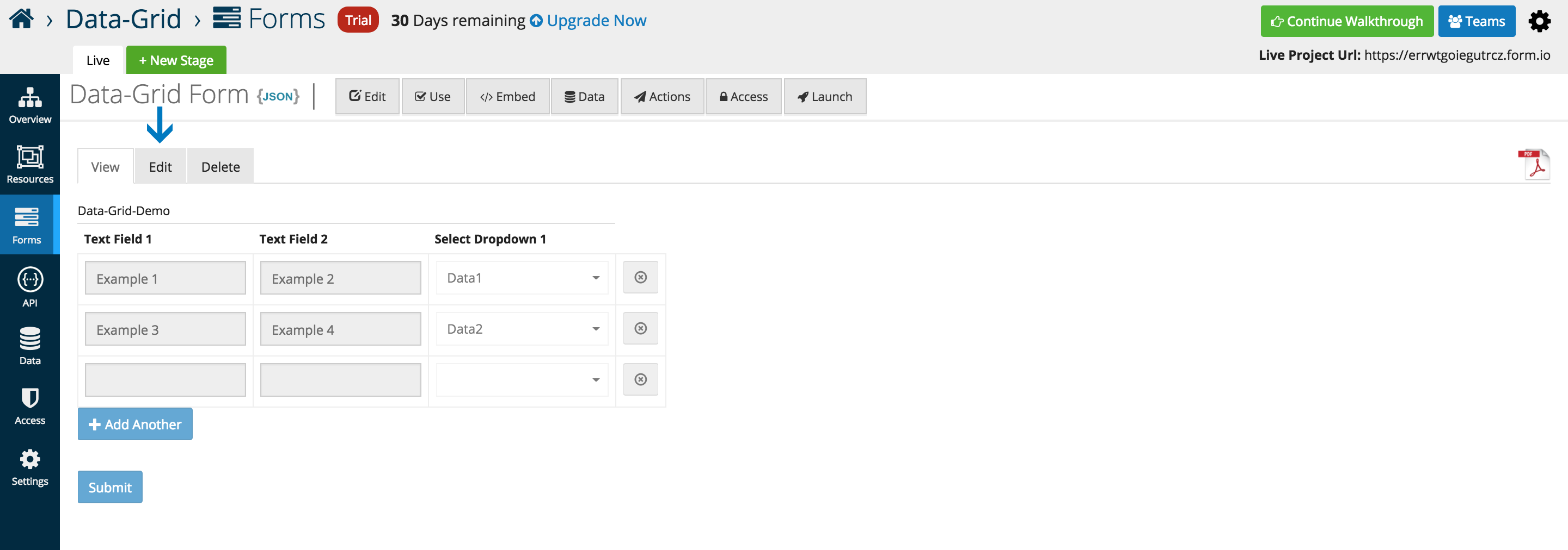
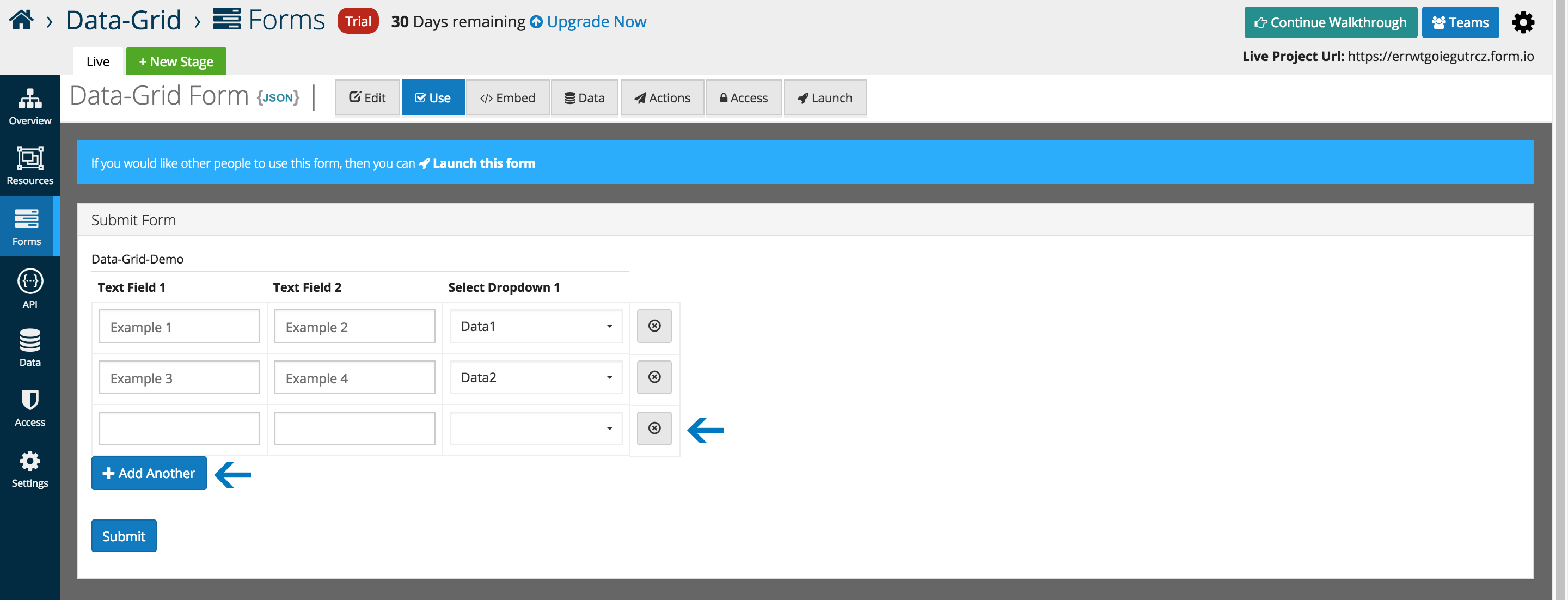
An example of the Data Grid displayed in the Use tab.

Rows can be dynamically added, and removed as highlighted below.
Data can be submitted and edited via the traditional platform interfaces.
