Button
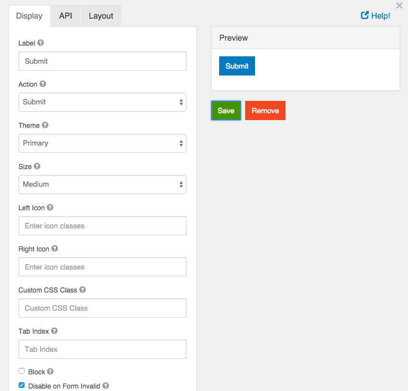
Buttons can be added to perform various actions within the form.

Label
This is the label or title that will appear on the button.
Action
This is the action that will be performed. Currently there are two actions that can be performed, submit and reset.
Submit
A submit action submits the form to either the form.io server or a custom callback url that has been priorly set up.
Reset
Reset the form fields back to their original state.
OAuth
Opens an OAuth authentication popup. This will only work after it has been assigned to an OAuth Action. See the OAuth guide for more information on how to set up OAuth in your project.
Theme
Set a theme (color) for the button. These options currently map to Bootstrap classes that will be added to the button.
Size
Set the size of the button. These options currently map to Bootstrap classes that will be added to the button.
Left Icon
If you have an icon library and would like to include an icon to the left of the button label, you can do so by adding the icon class here.
Right Icon
If you have an icon library and would like to include an icon to the right of the button label, you can do so by adding the icon class here.
Custom CSS Class
A custom CSS class to add to this component. You may add multiple class names separated by a space.
Tab Index
Sets the tabindex attribute of this component to override the tab order of the form. See the MDN documentation on tabindex for more information on how it works.
Block
If checked, the display of the button will be set to “block” which will cause it to span the full width of the container.
Disable on Form Invalid
If checked, this button will be disabled if any of the client side validation fails. This is useful for preventing the submission of a form that has invalid data entered.