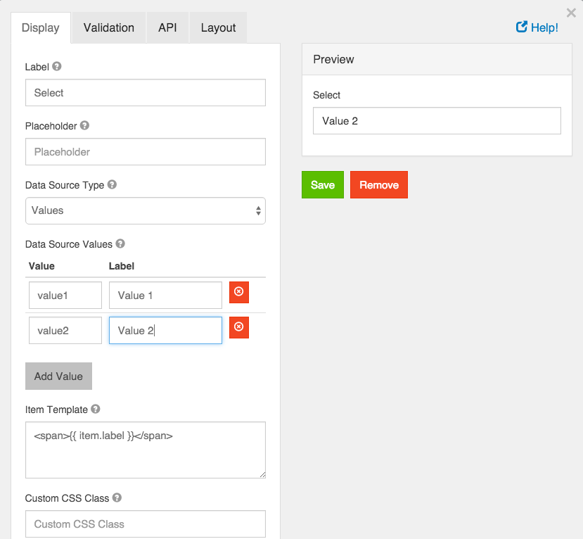
Select
A select field will display a list of values in a drop down list to users. Users can select one of the values.

Label
The label for this field that will appear next to it.
Placeholder
The placeholder text that will appear before an option is selected.
Data Source Type
Select the type of data the options will be pulled from.
Values
These are the values that will be selected on this field. The Value column is what will be stored in the database and the Label is what is shown to the users.
Raw Json
Enter a JSON Array to use. It should be formatted as an array of objects with named properties.
URL
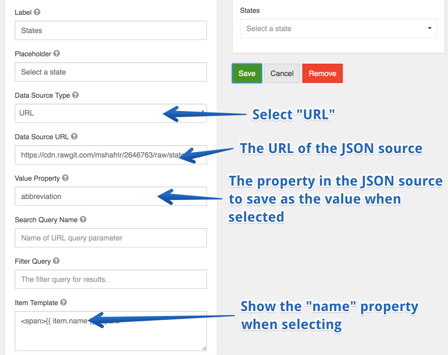
Enter a url with a data source in JSON Array format. This can be used to populate a Select list with external JSON values. For example, suppose you wish to populate your select drop down with a list of all States within the U.S. You can use an external JSON array like the following.
https://cdn.rawgit.com/mshafrir/2646763/raw/states_titlecase.json
And place that within the URL of the select drop down Data Source URL. You will then need to provide the Value Property as well as change the Item Template so that it will pull the right value as well as display correctly within the dropdown. The following image shows how the configuration would look for this particular setup.

This will now turn your select dropdown into a list of available States within the US.
Value Property
If Raw JSON or URL is selected, enter the name of the property on the objects that will contain the value that will be stored in the database.
Search Query Name
If URL is selected, enter the name of the search query parameter to filter requests with. Example, if your url is http://api.dogs.com/dogs, and this option is set to type, and the user types nice in the select field, then this component will send a request to http://api.dogs.com/dogs?type=nice and update the select items with the results. If this option is omitted, no new requests will be made when user enters text in the select field.
Item Template
If Raw JSON or URL is selected, use the template field to determine how the values will be displayed in the select box. You can use the item variable to access the current object in the array. For example, you can embed the value by using {{ item.value }} in a template.
Custom CSS Class
A custom CSS class to add to this component. You may add multiple class names separated by a space.
Tab Index
Sets the tabindex attribute of this component to override the tab order of the form. See the MDN documentation on tabindex for more information on how it works.

Required
If checked, the field will be required to have a value.
Dynamic Select Filtering
A very common use case that many people have in forms is to dynamically filter a Select dropdown based on the selection of another select dropdown. The most typical usecase is a form that provides the Make, Model, and Year of automobiles where when you select the Make dropdown, it filters the Model dropdown for those that are within that Make. This functionality is covered in detail in our user guide resources section .